The most secure and private browsing experience became usable
From an environmental activist in Uganda to a harassed woman in Russia, 2 to 8 million users access the internet through the Tor network, on a daily basis, looking for a private browsing experience. It can also help people get online in countries where the internet is blocked or censored. I’ve worked on an extensive plan to make Tor usable for everyone.
Organization: The Tor Project
Date: 2018-2020
Role: Product Design, Lead
What I did: Research, UI, UX, Product
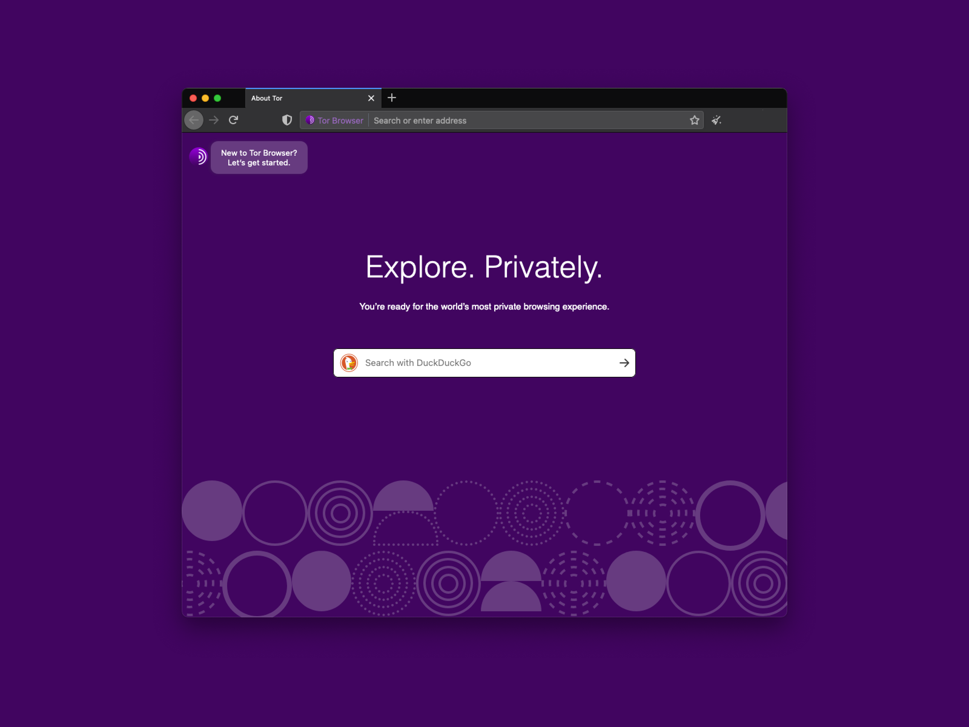
In my position as a Product Design Lead, I helped define the strategy and direction for the usability improvements in Tor Browser 7.5, 8, 8.5, 9, 9.5 and the upcoming 10.0 series. At some point, Lili Hay Newman said “now using Tor is easier than ever”.
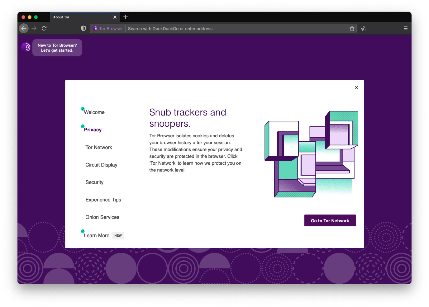
The user research program allowed us to collect continuous feedback from end-users without practicing extractive personal data collection. It also helped us to get a better understanding of who Tor users are. This feedback allowed us to iterate core legacy UX issues that the Tor Browser had accumulated throughout the years.
After mapping our users journey during the persona tool development, we worked on minimizing user’s pain points by prioritizing bug fixing and providing users clear information about what was happening while using the Tor Browser and the Tor network.
The user research program, community feedback and previous usability tests revealed that the browser’s core functionalities were seen as inconsistent and the browser was perceived as a very technical tool and per se “difficult to use”. We developed efforts to improve the usability of Tor Browser for end-users to boost their adoption. We approached core security features to make them intuitive for everyone, prioritizing non technical users and allowing advanced users to customize their experience.
Network security upgrade by prioritizing onions
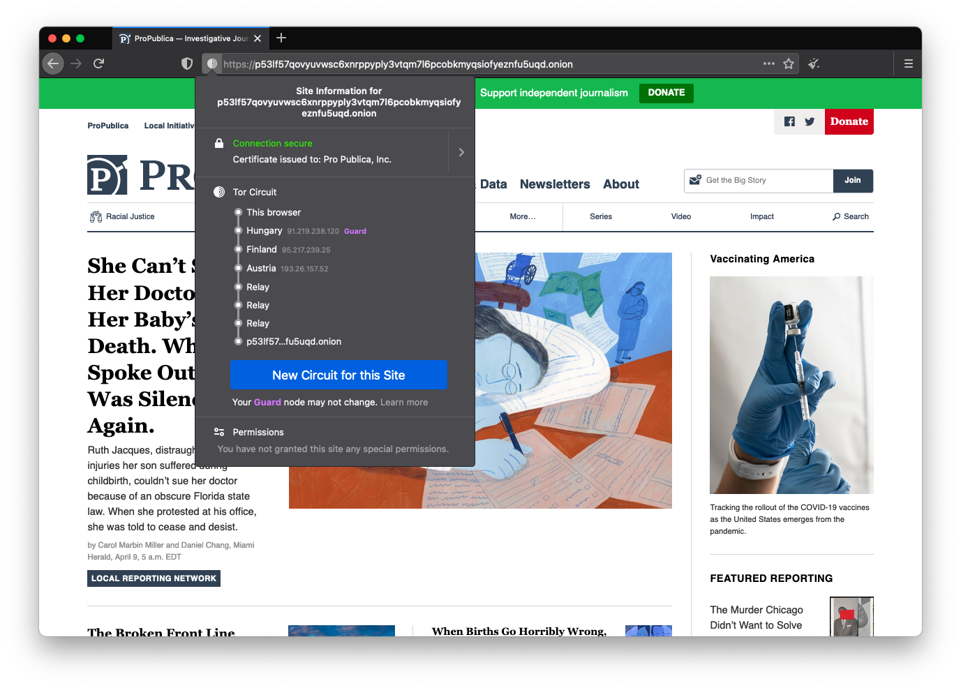
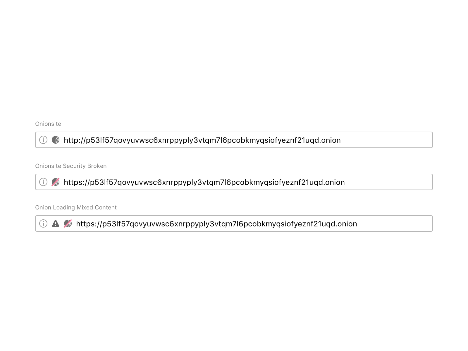
Tor’s onion routing remains the best way to achieve end-to-end anonymous communication on the Internet. With onion services, website administrators can provide their users with anonymous connections that are metadata-free or that hide metadata from any third party. Onion services are also one of the few censorship circumvention technologies that allow users to route around censorship while simultaneously protecting their privacy and identity.
The challenge here was to communicate security expectations about the current onion site so that users can be aware of any security breach or leak. The question was: what is the best way to let users know when the onion site they are visiting is not secure? Browsers traditionally rendered sites delivered via a secure transport protocol with a green lock icon. SSL UI is a hot topic in usable security design.
During the first iteration of this padlock, we tried a figurative onion icon in the URL bar. This caused a lot of confusion amongst users: some of them told us that the icon looked like a bomb!
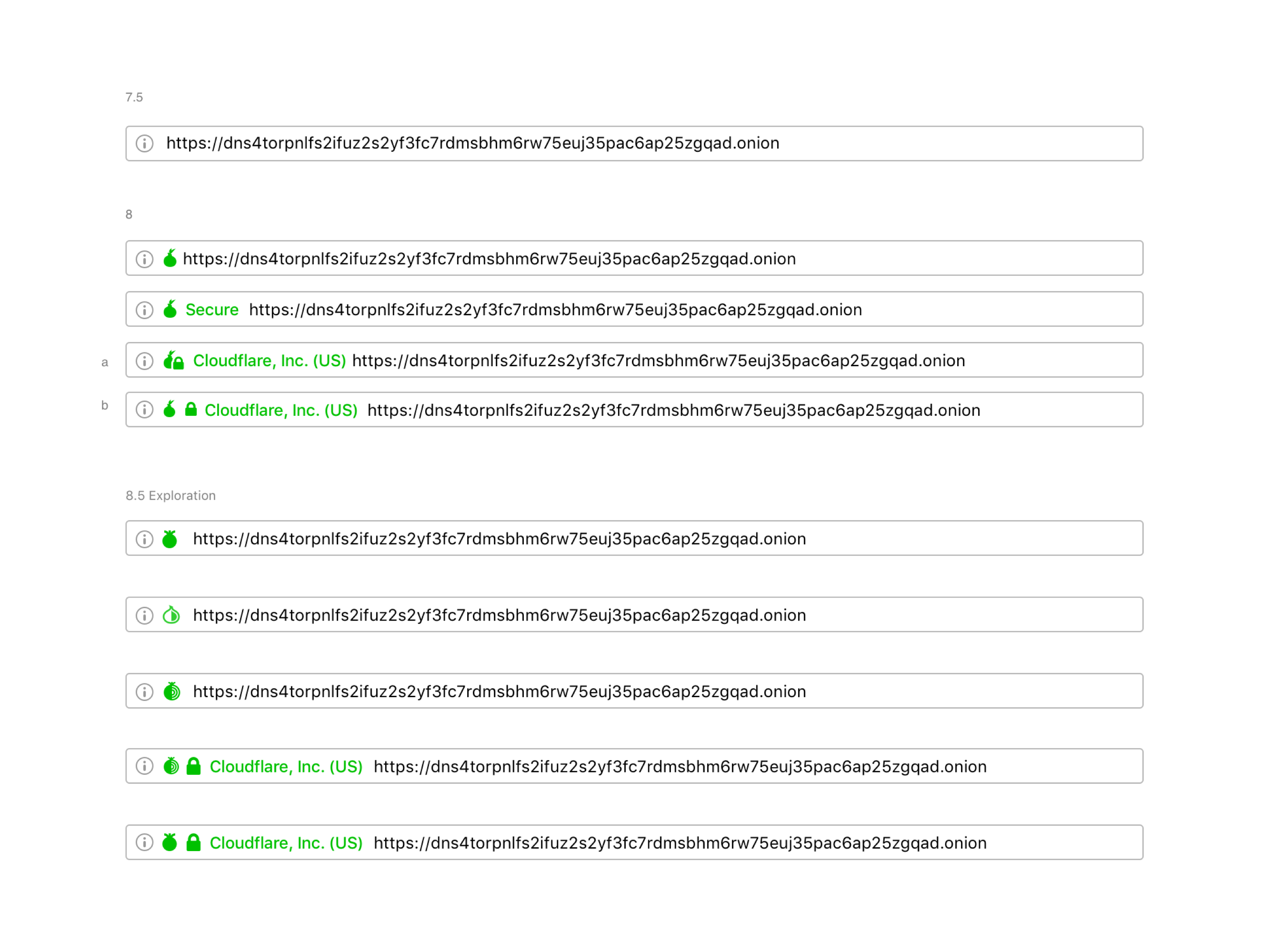
Major browsers iterated the formerly green icon for secure SSL to gray, intending to de-emphasize the default (safe) connection state and, instead, put more emphasis on broken or insecure connections. We understood that it was a benefit for the entire user base if we deployed experiences that are already familiar to users. So, we updated the colors of the Tor Browser security indicators to make it easier for users to understand when they are visiting a non-secure website by following the standard SSL approach. We also decided to use an abstract onion to help users identify when the site they are visiting is an onion service.
Improving the user experience reaching Onion sites
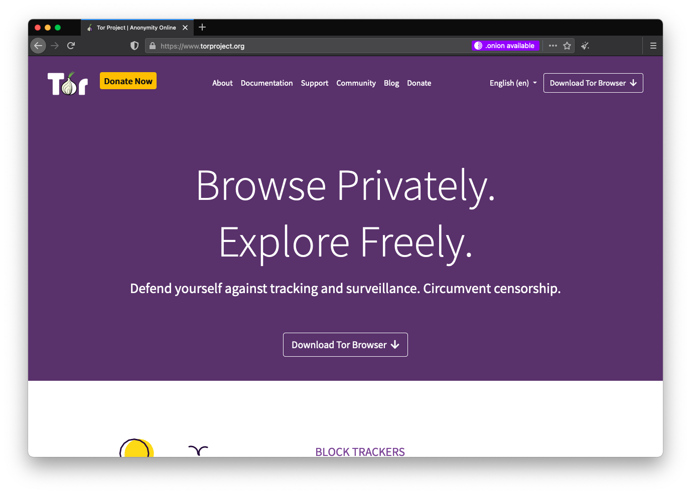
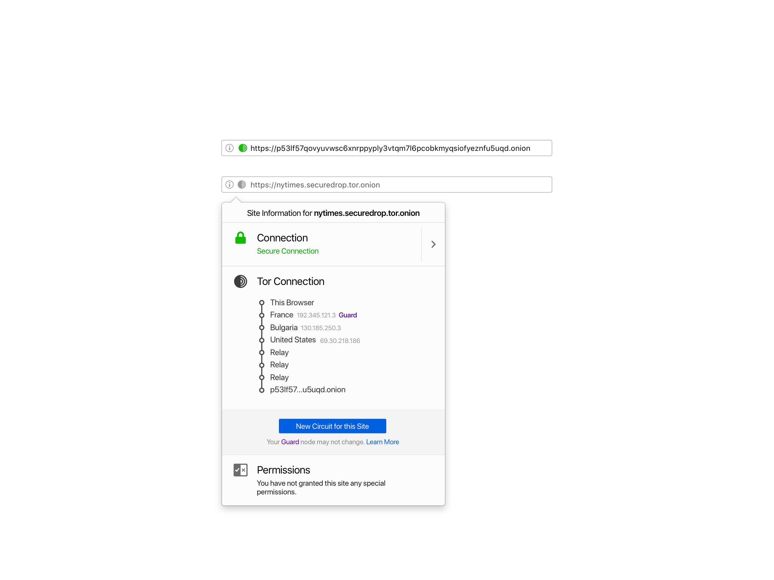
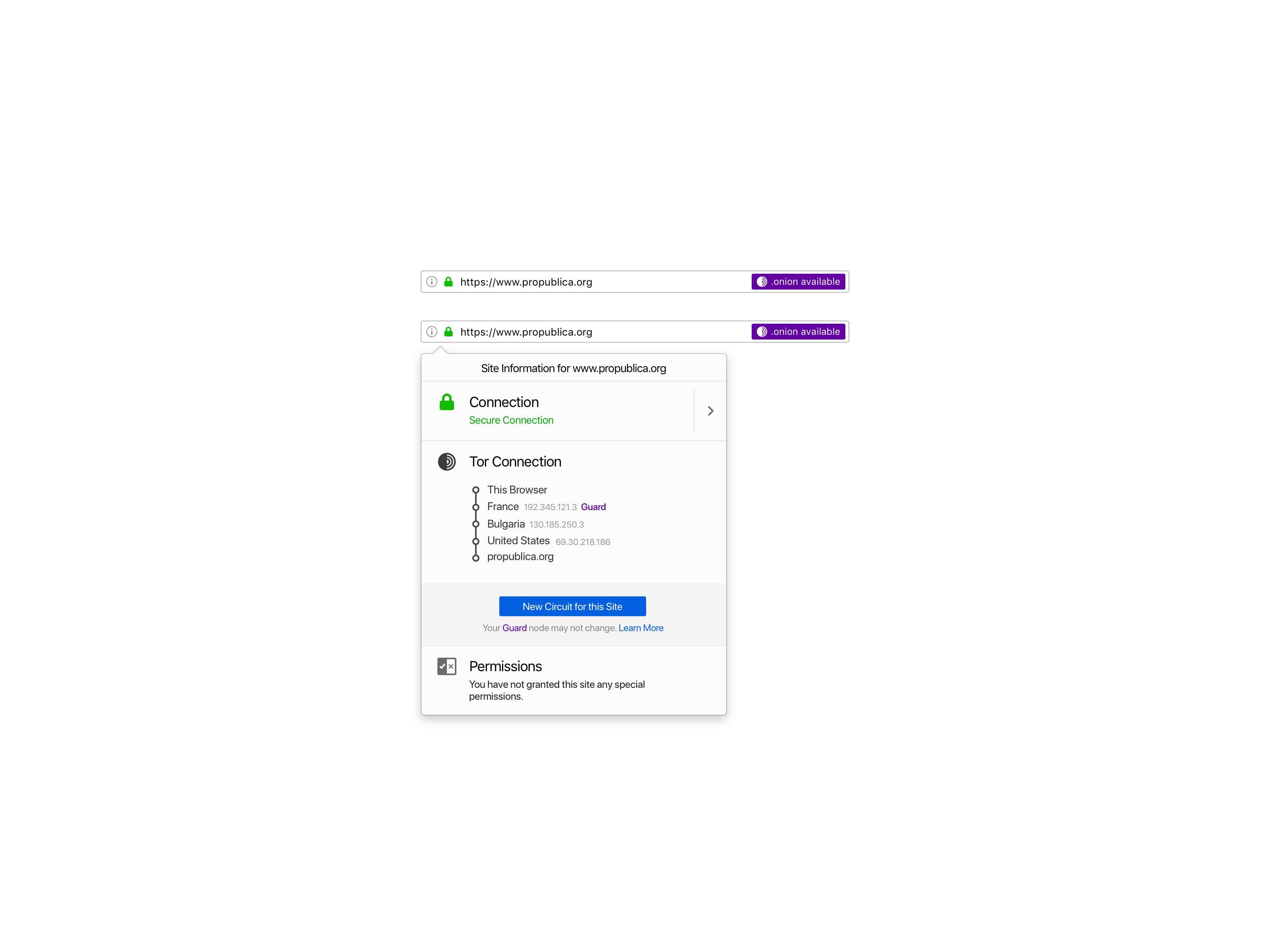
We released a user-consent-based feature called Onion Location. In contrast with the status-quo of current network security upgrades, Onion Location allows users to opt-in on its first-time use to upgrade their existing HTTP or HTTPS connection to a .onion one, if available.
We decided to allow users to opt-in because this was the first time that we were promoting onion services in Tor Browser. It was an opportunity for us to inform and educate users about onion services, help them discover onion versions of their favorite sites, and empower users to make an informed decision.
Sharing information with users about the technology trade-offs is being transparent and accountable. We exposed, within the global preferences, an option that allows users to prioritize onions when they are available.
The experience for developers is also seamless. Website publishers can advertise their onion service to Tor users by adding an HTTP header.
Client security upgrade by authenticating onions
Onion services can add an extra layer of security by providing users with a password to access them. The first iteration of this experience was using a standard HTTP authentication user flow. We iterated it to allow users to save their onion password in their local logins.
Redesign of Tor Browser’s security controls
Tor Browser have a number of technical mechanisms to address privacy and security issues. In order to provide vulnerability surface reduction for users that need high security, Tor Browser has implemented a security slider to allow users to make a tradeoff between usability and security while minimizing the total number of choices (to reduce fingerprinting). Using metrics collected from Mozilla’s bug tracker, developers analyzed the vulnerability counts of core components, to inform which features should be disabled at which security levels.
I’ve worked on the UI iteration of the component following the technical specs defined in the proposal. We explored dozen of options to improve users’ secure experience.
 |  |
|---|---|
 |  |
All this work with the Tor Browser allowed me to understand that designing usable secure interfaces means matching user’s mental models with what we offer as an interface to guarantee an intuitive experience.
I designed the first Tor Browser for Android, which aims to make private browsing mode the default in small devices by reducing device tracking.
Also, I created the new Tor Browser icon.